|
©2002-05 robert foddering
painting movement, painting from video, oil painting
photo, combine artistic practices, fine art layers, abstract art
image, abstract art painting, representing space, representing movement,
painting digital crossover, painting with video, painting from photo,
painting from video, video painting, painting figures moving, painting
using digital media, painting from life, painting life, figurative
artist, existential painting, figurative painting, painting onto
photographs, phenomenology, human movement, contemporary figurative
painting, figure painting, figure oil painting, painting human figure,
contemporary figurative art, contemporary fine art painting, painting
portfolio, online painting portfolio, painting for sale, figurative
fine art |
foddering.co.uk |
|
|
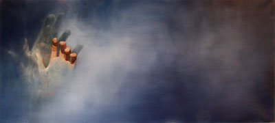
do people look at their hands more than they look in the mirror?
(i suppose it depends on who you're talking about?)
|
|
|
|

'take these hands'
oil on canvas 2004-06
140 cm x 75 cm
|
|
|
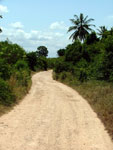
another image from kenya.
taken on the last day of the visit, from the road.
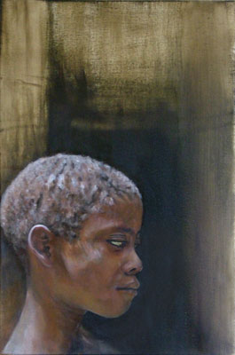
whilst painting 'makongeni boy' i used my mobile phone to take a couple of shots to record the development of the piece.
i've developed this a little further and used a 'proper' digital camera to record the development.
you can view it here.
each session was about four hours of work. |
|
|

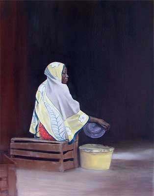
'diani woman'
oil on canvas 2004-05
75 cm x 50cm
|
|
|
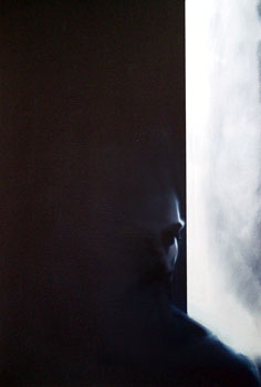
the source image for this painting was
taken whilst visiting kenya.
 |
specifically
a bike trip to makongeni village.
this turned into an unspoken
challenge to see who could cycle the fastest.
advice :
''don't challenge kenyan's to physical competitions.
they do press-ups for breakfast'' |
i selected this image out of the many
i took, as it had a interesting contrast to it.
the attempt at shaping the head out
of the dark background, only defined by the light and the
change of the skin tone seemed like an interesting challenge.
development.
i took a lot of photographs.
and somebody said:
"if you photograph everything then
eventually your memories become the photographs."
socrates
discussed the same principle.
if we write our knowledge down, we trust the writing rather
than using our memories. our knowledge from writing becomes
diluted, translated from the original intent.
sketchbooks
become translations of an idea, or image, not the idea or
image in it's original intended form.
my memories of kenya
aren't limited to my photos,
the photos remind me of where i was before and after i took
the shot. they spur memories i have. however to you they might
well present a diluted image of kenya, compared to me describing
my memories.
|
|
|

'makongeni boy'
oil on canvas 2004
54 cm x 35cm
|
|
|
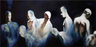
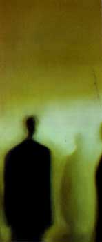
i liked the idea of painting the movement
of a figure painting a large canvas.
filming myself on a camcorder
i painted a large oblong canvas prussian
blue, similar to a rothko.
back on to the same canvas i painted
my movements in painting the rothko
background. (from the video)
i wanted to create a paradox about the
subject matter of the image. it's a painting about it's own
creation.
this didn't
work. i simplified the idea slightly. i defined a movement
in front of the canvas, that would work well compositionally
and filmed myself moving.
i watched the same two minute sequence
again and again, painting it in a loose paint in one tone.
after certain rhythms were made out in the sequence i began
to single out figures with the background
tone and other colours,
shapes that appeared to be the strongest.
i painted 'moth' mainly at night, and
the light often attracted moths. one unfortunate moth was
stunned by the heat of the light and it spiraled into my palette.
'moth' seemed like the correct title
for the piece.
see this link for the work in
progress
sketchbook |
|
|

'moth'
oil on canvas 2001-02
210cm x 160cm
|
|
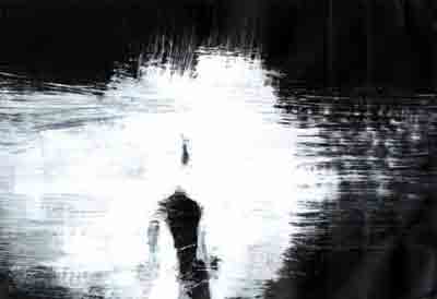
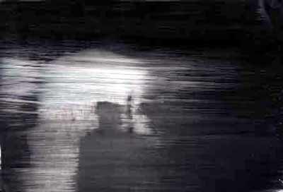
trm is a trademark of
a photocopy company, usually found in corner shops. (it's
probably tmr but it too late now.)

After standing at the local library laser photocopier,
photocopying the lid of the photocopier looking slightly
deranged, i ended up with about thirty of forty
black photocopies and an inquiry from
a lady if I knew what i was doing.
these images were executed quickly by
painting in white onto blank
laser photocopies, so the image starts black
and is constructed mainly from the application of white paint
onto the black
surface.
the source images are from a video of
a figure moving around in front of a strobe light. they were
initially created to construct into a multi layered painting
but unfortunately the outlines were too solid so they ended
up as quick studies.
however I did compile all the
singular studies into one image as can be seen here.
sketchbook |
|
|

'trm4'
gouache on laser copy 2002
29 x 21cm
|
|
|
another one of the trm
series.
sketchbook
|
|
|

'trm8'
gouache on laser copy 2002
29 x 21cm
|
|
|
in my opinion (!) paintings
that work have just enough
information for the viewer
to put the image together. the work shouldn't over state the
subject. an economy.
sometimes this can be the least satisfying
to paint. unless the picture presents a struggle to complete
it feels like nothing has been gained.
like going on holiday and everything
is plain sailing: it's relaxing and easy but you don't really
feel like you've experienced anything. (i'm prepared to put
this to scientific test, so please email your holiday donations
here.)
of course this depends on what you are
painting and what it calls for, sometimes there is no choice
to overstate. the only choice to be made is how well you paint
the minimum of information.
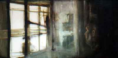
i've tried to put too much into a painting
before as can be see here
"where's the colour"?
sketchbook |
|
|

'window'
oil on canvas 2002
35 x 65cm
|
|
| frankenstein's
(not a) monster |
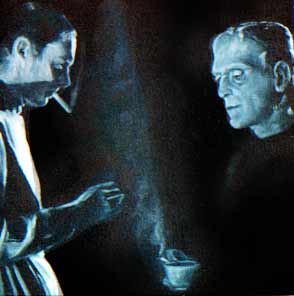
frankenstein as a film icon represents
the form of evil and something
horrific of human creation. a mistake that comes back to haunt
you. (usually in the form of robert de niro)
i liked this image as neither is applicable
here. The actors sit round having a cup of tea still in costume.
hence 'frankenstein's (not a)
monster.'
this painting was created for an exhibition
in a
cinema gallery as was 'composition'
sketchbook |
|
|
|
frankenstein's (not a) monster |

frankenstein's (not a) monster'
oil on canvas 1999
40cm x 40cm
|
|
|
investment bond brochure, corporate
soul?
sketchbook |
|
|

' brochure'
oil on canvas 1999
20cm x 40cm
|
|
|
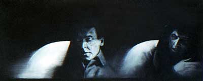
a painting based on two separate images,
matched together as they have the same curved shape and angular
line.
there's a small border on the bottom
of the painting, similar to the letterbox shape of a wide
screen camera, tv or cinema.
i wanted this to be a deliberate painting
about film and composition. i took certain liberties with
both images to try and match them together.
this can be seen in: the curved composition
of the car window (left half)
and the arm and shoulder (right)
and the diagonal of the window (left)
and the diagonal of the phone (right).
the black and white
image, composition and the letterbox canvas are hopefully
reminiscent of a dramatic cinema scene.... one involving car
driving and phone call making.
sketchbook |
|
|

'composition'
oil on canvas 1999
40cm x 20cm
|
|
|
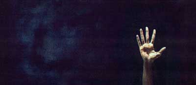
waving not drowning.
sketchbook |
|
|

'hand'
oil on canvas 1999
40cm x 20cm
|
|
|
'life room' is from a day spent in the
life room. painting the figure from life usually requires
focus, it's when you focus so intently on something that you
capture that which is beyond what you intended. or thought
you could.
the figure was painted into a loose
life room structure, the focus of the construct being on the
face. with black compositional spray paint
added later as an after thought in the studio.
sketchbook |
|
|

'life room'
oil on canvas 1998
250cm x 150cm
|
|
|
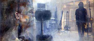
another day in the life room, painted
onto a photo that had been transferred to canvas.
the figure on the left is painted from
life, the background has also been painted over to provide
a balance between the painted figure and the photographic
background.
i had thought of a problem in representing
the space a figure occupies. the space around us is stationary
and we move through it. if we represent figures as they are
in that space, shouldn't they be less solid than the space
around them?
the focus and title for this piece is
'ear', as this was the only solid piece of the figure represented....and
the closest to the viewer.
sketchbook |
|
|

'ear'
oil on photographic transfer 1998
35cm x 15cm
|
|
|
this is a detail of an early painting.
The rest of the picture was confused.
sometimes you try to put too much into
a painting and after all those ideas all you are left with
is the painting, as the ideas fail to come through.
some ideas are suited to painting, some
are not. i would like to be proficient in all mediums so that
i could render in the medium most suited to the idea.
what i was trying to say in this piece
could have worked better as a short film.
sketchbook |
|
|

ident' (detail)
oil on canvas 1997
200cm x 150cm
|
|
|
